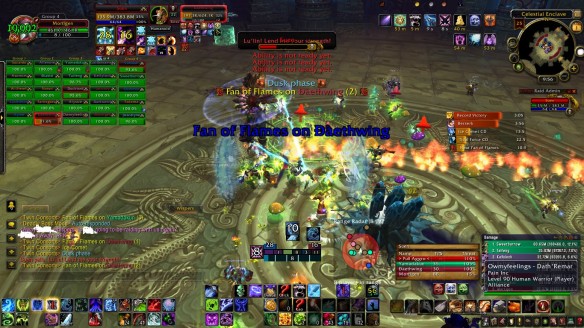
I love a good 25 man roflstomp run, and also can’t help but share my ingloriously poor UI layout. In the screenie below you can see why. I can hardly see much of the screen without my own UI elements getting clogged, and then the amount of malarky in the floor and flying through the air has my character somewhere in the middle of the red fire, green fire, blue beam, and near the grey/blue crystal. I think.
This is the twin consorts in Throne of Thunder, or the fight I like to call “Wheeeee, chase the girly swirly fire, opsie! Anyone got a rez, lol”.
 LFR, Love it. I could probably remove the dps meter, and I should move some of the non-essential buttons on the middle bottom to the right, after moving the stuff on the lower right to some sort of radial menu. But it is LFR and doing 80-90k dps is fine in there.

I usually read your posts in my email on my phone, so never remember to reply 😛
The spell affects in 25-man are kinda fun until you are trying to down a boss in progression. I am having a hell of a time staying out of sand traps on Horridon normal. Standing in bad is something I don’t usually have an issue with… but how do you stay out of bad if you can’t see it?
Some Blizz dev tweeted not too long ago that all the cool-looking spells prob need to be toned down a bit….
I’ve turned down my UI detail and the depth, which makes the game renders bit better, but also gets me standing in bad more often as it is harder to see. Kind of a Catch-22, fast system speed and FPS is needed to know the effect is there, but with lower graphica performance you cant see it anyway.
Pingback: Group Quest #119: FLEXing because we can | Group Quest